. . . and innovative projects . . .

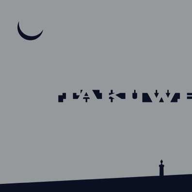
The Takuwe logo is comprised of four design components. From top to bottom, they include a crescent moon, the title of the exhibition, a silhouette of a grave marker and a horizon line.
The moon image represents a four-day old waxing crescent moon. December 11, 1890 was a new moon. Four days later, during the early moonless morning of December 15, Sitting Bull was assassinated. The crescent moon rose later that morning at 10:47. The crescent moon is also one of the central iconological images associated with the Ghost Dance.
The title of the exhibition is Takuwe, a Lakota word that translates into English as “why.” The letters of this word are shaped into a rectangle that is proportional to the size of the mass grave dug on January 3, 1891 for the bodies of the Lakota children, women and men who were massacred at Wounded Knee on December 29, 1890. Military accounts report that the grave was 6 feet wide, 72 feet long and 5 feet deep. The letter font is Playbill, a slab serif design that was often used to invoke the west, particularly the wild-west. The spacing between the letters is purposefully compressed so that the serifs overlap, thereby evoking how the frozen bodies of the slain Lakotas were thrown into the common grave and then “the soldiers jumped in to tramp down the dead.” Because the font color is identical to the background color, the letters are difficult to discern. The background passes through the design, thereby symbolically connecting the buried bodies with the land and the sky. The letters also extend beyond the logo border, suggesting that the ramifications of the Wounded Knee massacre stretch through time and across space.
The silhouette near the bottom is of the grave marker that Joseph Horn Cloud designed, paid for and erected alongside the mass grave in 1903. It stands there today. He survived the massacre, but many of his relatives did not. Carved into the granite monument are the names of 146 of the persons who were massacred that December day.
The long narrow grave was dug into a small hill. The sloping horizon line along the bottom of the logo references this landscape. It is a dark blue color identical to the crescent moon and the spaces between the title letters. It contrasts with the flat gray background color that symbolizes the tragedy – the almost unimaginable wrongs – that were committed by the U.S. military against defenseless and innocent children, women and men at Wounded Knee.
Logo